
Looking for Green Energy Loopholes
I have been absent from this blog for a while, but not disinterested. Hopefully this will be a new start with lots of new material.

I have been absent from this blog for a while, but not disinterested. Hopefully this will be a new start with lots of new material.

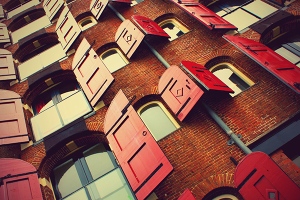
Fun opportunity to add color!
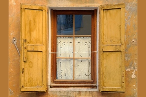
These are real and work too keep out sun and weather.
Difficult to say how important these are for protection from the elements but at least they are real and work.
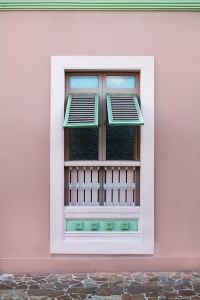
These shutters are a design elements, act as awnings, and keep out the weather. Triple duty!
A while ago I wrote a post called “De-shuttering Our World.” I’m afraid it was not completely flattering to the application of most shutters, my biggest complaint(s) being that most are ill used, and don’t actually work.
All of the shutters in this post, on the other hand, actually work and serve, often multiple, and very real purposes. This may qualify them for my definition of classic, which brings me to the last photo on the bottom and the reason for this post, which is to inquire, “about what shutters have to do with classic design?” The answer: a lot when they work!
Does this mean that classic design is a product of function? Well yes I suppose it does. Certainly if one scours the architecture history books long treatises moralizing on the subject will quickly appear. Likewise function is seen as the classical root of many products, cars, software, even business systems. It would appear that form follows function is a classical standard. One that nicely applies to the little manufactured home in the bottom image.
The need to justify having thus been satisfied, I am now allowed to say that I picked the place because I like it. If I were looking for a sunny place to hang my hat I would take it in a heartbeat.
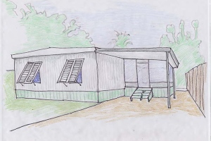
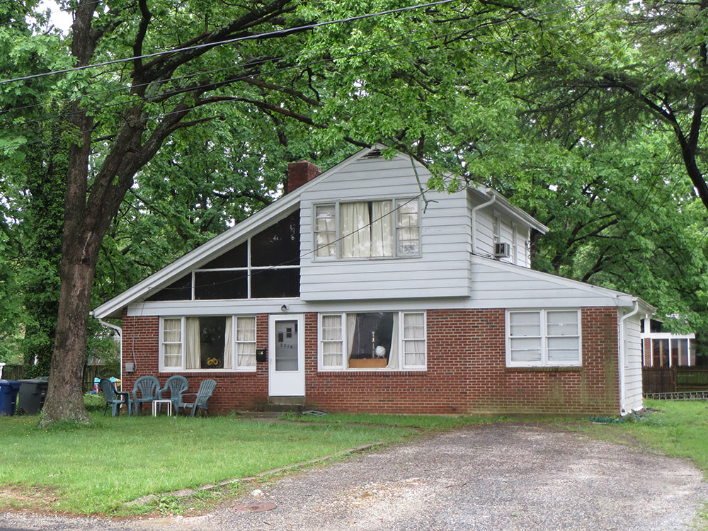
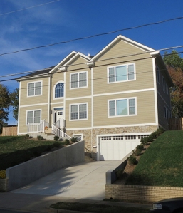
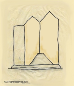
Classic manufactured home. I had to draw a picture because the photos of the house were copyrighted. Follow the link to see how it actually looks.
Why? It is all about function, i.e., metal siding, hurricane shutters, carport, porch enclosure, and fence, all are there for a reason, even its overall size and roof angle has clearly been designed to fit on the back of a delivery truck.
Nothing more is included. The construction materials look, manufactured, otherwise it is without decoration. Only the skirt around the base of the building, because of its color, hints at a bit of amplification. The house is austere, un-contrived, accidentally modern and therefore pretty special.
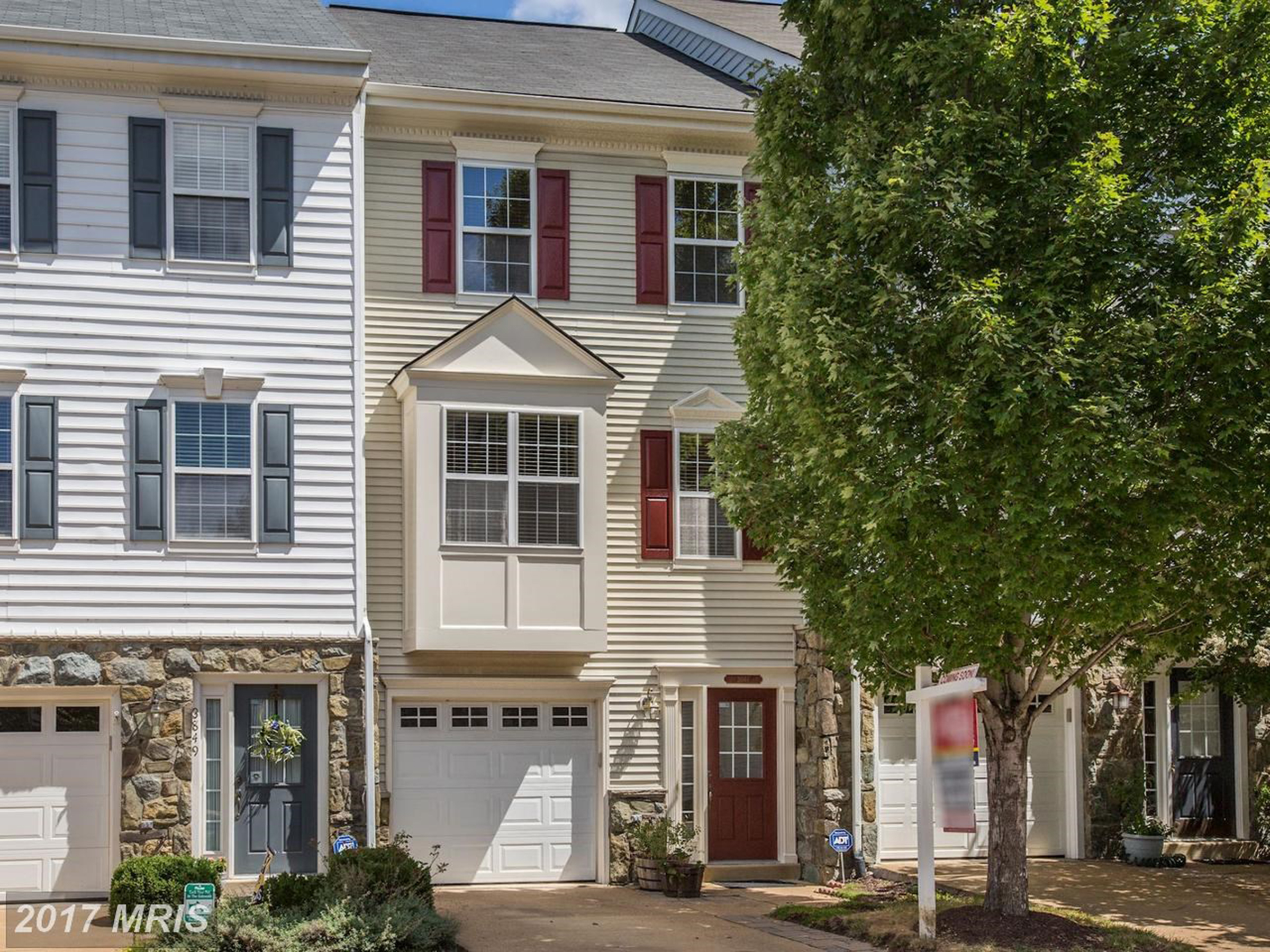
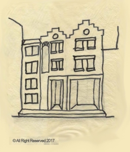
Basic town house found in any town USA
Better than a tiny house? – This is the face of many pseudo urban commuter suburbs in the US. Not such bad places really, especially if one seeks the untroubled reverie of commonality, the refuge of normalcy in uncertain times. By many standards the place is actually a pillar of luxury. Who, with jobs, kids, grandkids, and stuff, could argue with 3 bedrooms, 3 bathrooms, a big kitchen, actual dining room, “whatever” room, off street parking and a security system too. Why then, in the face of such naked functionality, does this place leave some of us feeling mildly depressed? I don’t think that I really want to know why, or more likely want to face it.
Admitting that color feels good! Rather than subject the reader to more dreary investigations, I thought it would be a lot more fun to look at what makes many of us feel good! That, of course, would be bold, bright, primary, unapologetic color.
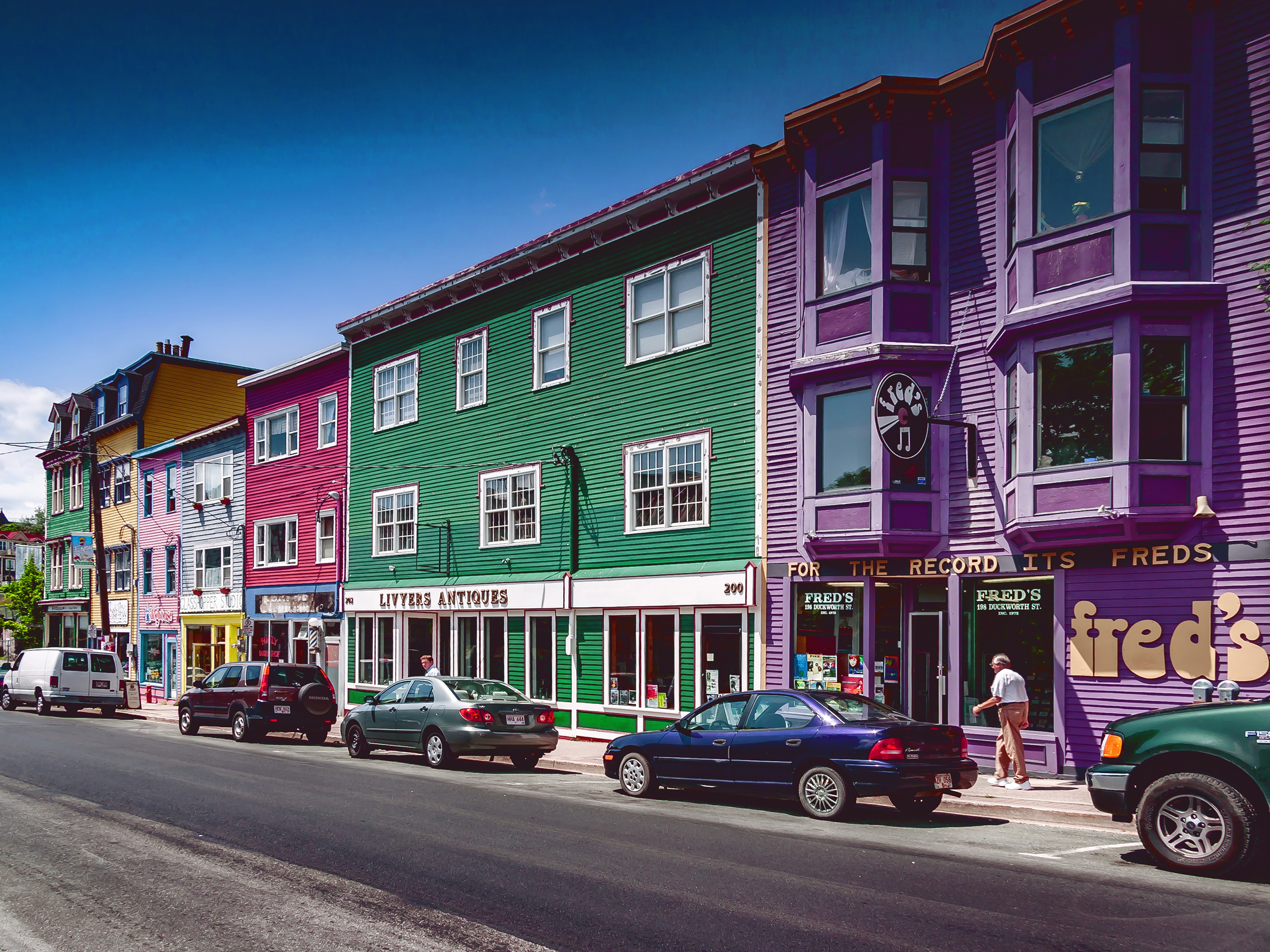
Colorful historic downtown mixed use.
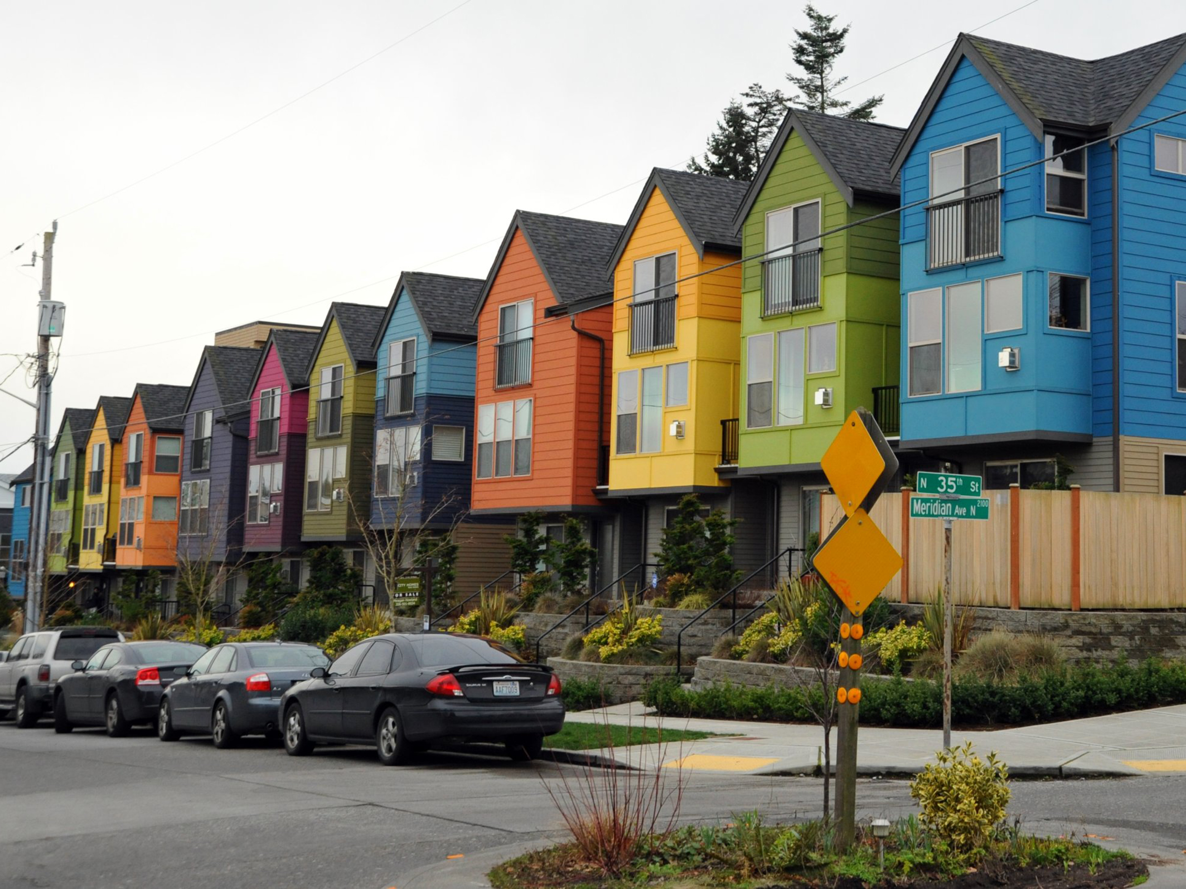
Colorful townhouses.
Advocating for reinstatement. I often wonder why we have removed it from our visual life, demoted it to a position of the unsophisticated, even crass. I for one would like to see it reinstated. I wonder what the home owners association would say if the home owner in the photo above were to apply for approval to repaint the house as per below? Approval or not, it definitely makes me feel a lot better about the house.
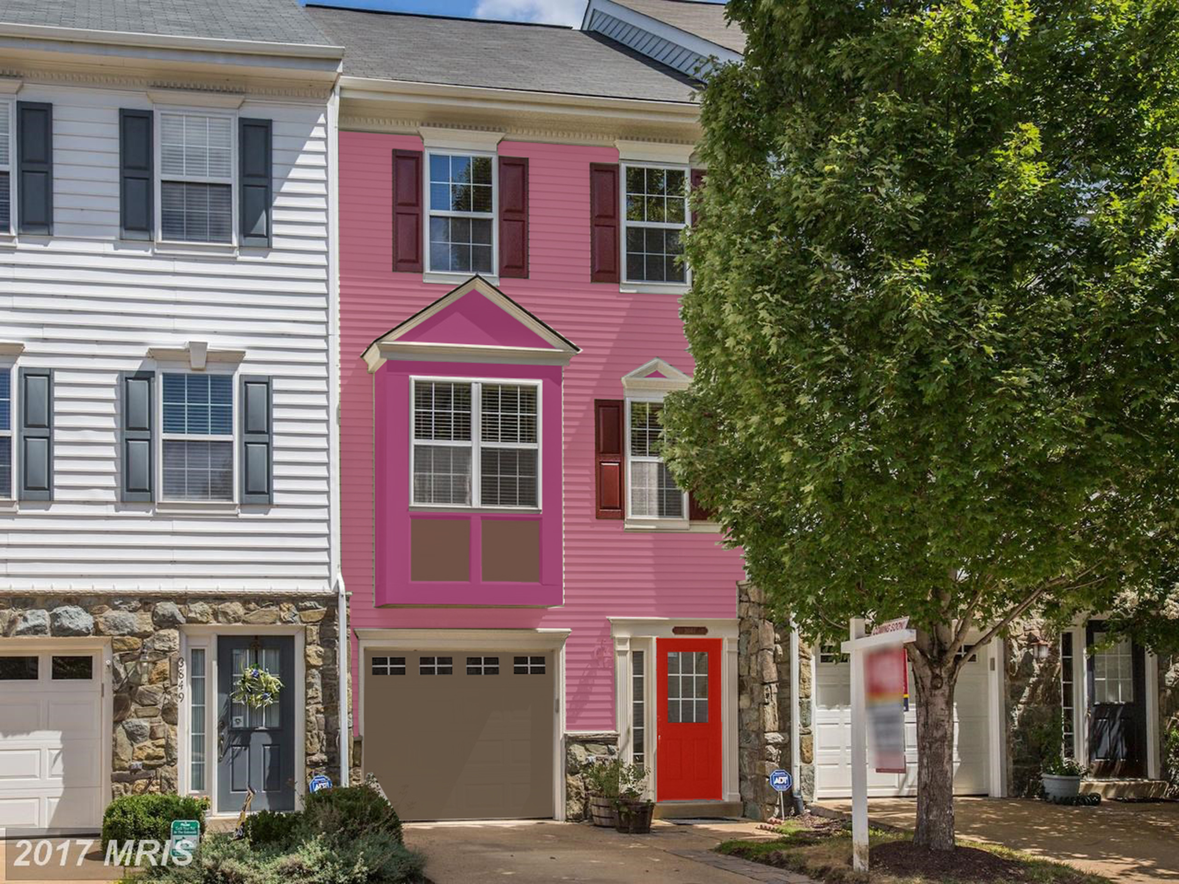
Defying the HOA
Holy Cow! This looks a like the concept house in the header, begging the question; “do I own it or change it?”
Artistic Logic – Where do I start with this one? The temptation is to say what makes a home owner do things like this, until I think, “maybe the homeowner didn’t do it.” Maybe it was a builder? Probably not. Those guys are all about conformity and resale value. What/wherever the idea came from doesn’t matter. I looks pretty strange to most of us. Yet, I hesitate to criticize, because I somehow find artistic logic in what was done. Honestly, I see things like this in modern art museums all the time. There has been a kind of purists pursuit of geometry while totally ignoring everything else. The effect is humorous. It makes me smile which is not such a bad thing for a house to do.

Typical Vernacular House.
Vernacular Building – It also points to another interesting question. Is the split level house a form of “new” vernacular? What does that word mean? Wikipedia says it is “an architectural style that is designed based on local needs, availability of construction materials and reflecting local traditions..,” without the use of “…formally-schooled architects.” There are text books written on the subject, but I like this definition. It sums up how I think about vernacular building (notice that I did not call it architecture, but that is a subject for another day). The definition almost, but not quite, fits the split level place. There is a utilitarian and historical implication associated with vernacular buildings that often manifest as a foundation for some future style, or expression of a recognizable over riding unity. The split level house meets the utilitarian criteria but hardy the historical one. The log cabin meets them both.
Noteworthy? – Psychologist define many different ways of learning. I suppose that perception is particular to each individual and that mine is visual. Often, I see something noteworthy without any idea why. Only after some time and conscious analysis does the meaning reveal itself. For me the split level house is like that. It sent a message that read; ” I may be an anomaly but I am also an individual who is unconscious of, and therefore uninfluenced by, architectural and stylistic mores.” The message is totally unsophisticated. It redefines how we think about building and points toward a fresh approach to design, the pursuit of which being the reason for this this blog.

Hi Hugh! This Hugh Newell Jacobsen.
is a semi famous, and as it happens, local architect; the kind that mostly architecture students and the “arts and croissants” crowd know about. As first year architecture students, way back in the 1990’s, we were once given the name of an important “architectural luminary” and told to copy his style. I remember having thought that I lucked out because I got Frank Lloyd Wright. My friend, on the other hand, got Hugh. Now I think that he was the lucky one.
If you look up Hugh Newell Jacobsen, Wikipedia will tell you that his architecture is simple. If you then decide to do a search on the term “simple architecture” you will find all manner of modern, very un-simple houses. You may even ask yourself, “what is simple? Is it definable?”
This is the house that Hugh built. Sorry you need to google him for images. I couldn’t find any that were labeled for reuse, so a drew a picture.
One I will explore a bit here. The most important thing to know about simple architecture is that the architect is a decision maker, and I didn’t read this anywhere. I just know it. Architecture, like language is semiotic. Think of it as “logo-centric,” meaning just about every person who has ever lived in a house has some notion of how one should/does look. If there are 248 million adults living in the US, then it follows that an equal number of mirages make up the collective dictionary of residential architecture. Likewise, if you think of them as words, then it is not too difficult to see that Jacobsen decided to use only vowels to write his. He ended up with “Snoopy’s Dog House.” Of course, the decision forced him to use every sophisticated architectural trick in the book, i.e. scale, proportion, repetition, texture…, to design an ethereal dog house, simple to recognize, not simple to achieve.
 Common Simplicity
Is it possible to find simplicity in our real low budget, often crowded, every day world? Is it possible to make these places ethereal? Us everyday, “non luminary” architects ask ourselves these questions all the time.
Take a look at these houses. What would it take to make them “ethereal?” Can a 3′ ribbon of grass fit between the raw yard and the house? Can the roof vents be moved to the back where they don’t show? Can the window frame be made to disappear into the building? Can the stair  landing become a low deck extending the full width of the house? Can the railing become a panel type element to match the house? Can the siding be made from something besides vinyl?
The answer of course is yes to all. Do these changes make the places “ethereal?” Probably not. Maybe though, in today’s complex built environment, common simplicity is not a bad place for the eye to rest.
Authors note: Original article is written for and posted in Aspire Design and Home. You might want to check them out, or just read it here.
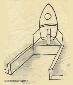
 Rocket Launch – Since I am already on the subject of houses on hilltops, I might as well take a look at this one. Something strange happens to ones perception of space when approaching a tall house, up a hill, with pointy gables. It starts to feel like one is approaching a rocket launch. The flat facade of the building adds to the effect because there is no intervening element to catch the viewers attention and stop the upward motion. This is reinforced by the driveway wall which also points, behaving like a one point perspective, drawing the viewer’s eye toward some infinite point on the horizon.
Single Visual Element – A bit of academic analysis clearly gives us to understand that, from a design standpoint, the house in the photo really starts at the street. It is one with the driveway; a single visual element, dominated by an extremely strong profile, defined by vertical lines which terminate in arrows pointing skyward. Have you ever driven through a farm town and seen the silos next to a railway? The only thing missing from the photo of the house under consideration is the train.
Transformation by Decoration – Also worth considering is that rows of tall flat facades, springing directly up from sidewalks, show up in residential buildings in places like Paris, Vienna and New York. These buildings are transformed, by dint of decoration. Variations in the size, placement and celebration of openings, add complexity to the extent that one barely realizes they are tall, which begins to suggest that height might be something to cultivate rather than disdain, as I was at first inclined to do.
Why so Awkward – Likewise I am led to ask, if not the height, then why so awkward. The answer, of course, is that on some level most of us understand that the unity of form and purpose evident in the row house, the silo, and even the rocket is missing in the suburban residence. We end up with what I call a “fusion tract house,” sporting a garage door, a couple of gables, and the arched part of a “Palladian” window, all forced into a shape that does not suit.
Architectural Form – If this home owner were my client I would, without going too far into value judgements, simply ask if this tall silhouette is one that he/she would choose to put in a typical suburban neighborhood in “any-town” USA. If the answer was yes, then I would advise that the homeowner embrace the concept by loosing the “home depot” doors, windows, and finishes in favor of a stark functional version, organized to reinforce the architecture. If, on the other hand, the answer was “not so much,” I would recommend either a different site or a different architectural form.
Bridget Gaddis, is a Licensed Architect and LEED Accredited Professionnal practicing nationally, and locally in the Washington DC area. She holds professional degrees in both Architecture and Interior Design and has a comprehensive background in commercial retail design, planning and construction. She has many years experience working for well known architects, developers and retailers. In 2011 she started Gaddis Architect an independent practice in Alexandria, VA. In addition, Ms. Gaddis has an interest in residential projects and is the author of “Real People Don’t Hire Architects,” a blog about houses.
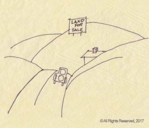
Land for Sale
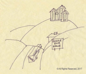
House for Sale
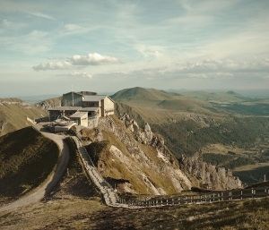
Which is better, house or the hilltop?

Strip Mine

German Castle
Anyone who has driven down an interstate through a hilly or mountainous area in the US has seen these places. I often wonder what piece of psychology makes a home owner want to live on top of a mountain enough to cut off said mountain top?
Strip mining for example – I think I just compared a house to a strip mine – is understandable. Miners must cut off the mountain to get the coal, which makes them a lot of money. It is what they value. Big box retailers like Walmart do this too, which is also understandable. They want to be seen from the freeway. It brings them more customers.
Historically, people went to considerable trouble to build on promontories as an act of defense, because the locations were hard to attack. They were very visible, and of course, the seen can also see. Which may be key to my question. Maybe the mountain top home owner likes the view. For a second this is believable, certainly it is what he or she would tell anyone inclined to listen. Then one realizes that the little house half way down the hillside most likely has an equally breathtaking view, until a “Pile-A-House” was plunked into the main site line, that is!
Romantically – Has the mountain top home owner romanticized the historic castle? Does he or she think the pile of bricks, mortar, wood panels and asphalt shingles is somehow it’s equal, or perhaps better. Is there a place for the natural mountain top in this line of thinking?
Unfortunately, I don’t know the answer. I do wish they would stop it, though! One thing I know is that a good architect could fit a house up there without making the neighbor want to move. More population must mean less nature. Careful consideration of where not to build leads to challenges about how we actually do. Challenges best met by an architect.
Recently a reader ask for my opinion on a project. We shared numerous images, had email discussions and a phone call. I think we opened several design possibilities worth a discussion here. Follow along with the discussion and add your “two cents” in the comments section. Maybe someone out there has even better ideas than those offered here.
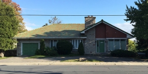
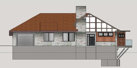
Existing House – The reader was planning a complete remodel of an existing “Mid Century Modern” house. He sent me images of the existing house, some renderings of what he was planning to do, as well as a really great original booklet with plans of similar house designs from the same historic period which can be found here.
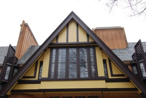
Reader’s Question – His initial question was about the windows. He sent me the proposed design shown above and asked me, in particular, what I thought about the sash windows, including decorative glass and external shutters, that are between the garage door and the chimney in the image. He also asked me for comments on the use of color. I sometimes think that clients need a hook; a way of tacitly enjoining a larger critique. Clearly, I couldn’t begin to think about details like window styles without first examining their context, which in this case involved a two part observation. I thought, “this design is very Frank Lloyd Wright, and it is actually quite nicely done.”
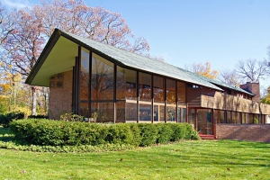
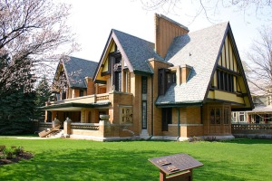
Frank Lloyd Wright: Mid Century Modernist? – The crux of my observation about Wright is in the question about whether or not he can be grouped with the “Mid Century Modernists.” The answer is that it is done all the time, but Wright was more. He was an influencer with deep roots in the historic transition from the Victorian to Modern world. Evidence of this transition can be seen especially in his early work and it is important to this discussion because the design proposed by the reader evokes this link which, I think, justifies the design and provides an answer to his question about the windows.
The Design Process – Before I go into examples, (if you are bored by theories just skip this paragraph) I should offer a disclaimer about the design process in general. Most, if not all, design is a product of selected influences found in the greater environment in which it appears. In short, ideas do not occur in a vacuum. This is not to imply that we remember the source of these inclinations. It only means that we somehow carry various visual impressions around in our psyche and pull them out when needed. This is true with large stylistic movements that show up in the built environment, and especially when considering an architect as well thought of, and with such far reaching influence as had Frank Lloyd Wright. I am pretty sure the reader who designed this remodel gave little thought to the source of his ideas, and, when he finally decide to look, came up with the previously mentioned booklet; providing an example of how the “Modern Movement in Architecture,” which had originated with Wright and others, manifested in commercial track housing looking exactly like the house that the reader was proposing to fix. This was interesting for sure, but of little relevance in view of the proposed design which was good on it’s own merit not a little because it was specifically suggestive of Wright’s early work, whether the reader knew it or not.
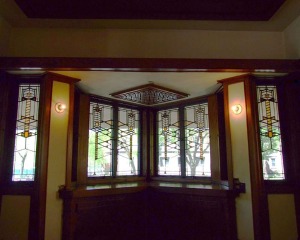
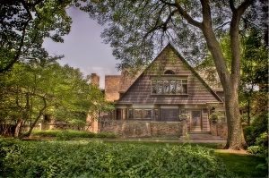
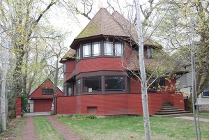
Citing the Evidence – I did some research and came up with these examples. They go a long way towards explaining why I thought the readers design was “very” Frank Lloyd Wright. I picked them because they contained elements in common with the proposed design as noted below each image.
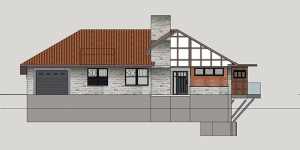
Suggested Revision
Possible Solution – Just to restate the problem – in case you forgot already – the reader asked me to comment on the two sets of sash windows with the decorative glass and external shutters that are shown in his proposed design. Based on the research, and assuming the reader intended to install in the existing openings, I recommended that casement windows be used instead of sash, which are almost never used by Wright and generally not strongly evident in “Mid Century Modern” houses from this era. I further suggested that a simple geometric muntin pattern offset from the mullions like those in the last research example above would work. The reader did not ask me about the garage door, nevertheless I suggested he change it to a simple door with horizontal divisions which I thought worked better than the existing which had fielded panels and “colonial” references.
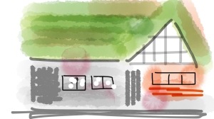
Artwork by Reader
Let’s Not Forget the Color – Finally the reader sent me this fun bit of artwork and ask me what I thought of the color. The greenish color of the existing tile roof seems unique to this house and, I think, adds personality. The rest of the natural colored materials are working and support the new design. Trim and the garage door are best colored to disappear. Check out Wright’s Studio above. Continuing a bit of green might be used to attract attention to the front door but it is not really necessary.
Special thanks to Angelo Corriea, a builder from our Northern neighbor, who sent me this project, but really didn’t need my help as he created a nice design on his own. Also, for you serious students of design, it might be worth checking out the connections between Frank Lloyd Wright, Henry Hobson Richardson, and Louis Sullivan.
Bridget Gaddis, is a Licensed Architect and LEED-accredited Professional practicing nationally, and locally in the Washington DC area. She holds professional degrees in both Architecture and Interior Design, and with a comprehensive background in commercial retail design, planning and construction has completed projects for such for such well known brands as Chloe, Zegna, and Bvlgari. Her career began in tenant coordination and site planning for two well-known Cleveland developers, followed by six years in store planning for a national retailer. After a move to New York City in 1997, she spent the next years working for architecture firms specializing in retail projects. In 2011 she started her own practice in Alexandria, VA. Ms. Gaddis is the author of two blogs dealing with architectural subjects.

You guys all recognize these don’t you? Ok, maybe not!
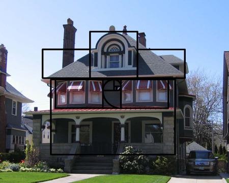
Architecture with a Capital A: Some would say that these images demonstrate the foundation of Architecture, with a capital A. Whatever your opinion, they are proportioning systems with academic roots in the ancient world. They are all based on a thing called the “Golden Ratio” and, like it or not, they work. The temptation, which I will resist, is to go into a discussion of what they are and where they are used. A one minute google search will inform any unacquainted reader and spare me the trouble of saying again what others have said often and better.
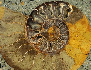
Numerous examples of the golden ratio demonstrate that proportion appears everywhere in nature.
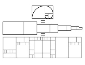
Proportion, based on the golden ratio, can be thought of as an infinitely expanding and contracting telescope of repeating pattern: rectangle exactly divide by a square, another rectangle divided by square, another rec…
Proportion is Indigenous: So, if not to explain, then why bring it up? Because proportion, as defined by the “Golden Ratio” is indigenous. It is part of nature, and when used in the built world, proceeds from the human condition; meaning that many, if not most, of us recognize, relate, find comfort, inspiration, and just plain beauty in an entity displaying proportional properties; those being, the parts relate to the whole and they do so in an organized way.
Has Proportion Disappeared? Sadly, proportion, at least in the classical sense discussed here, is mostly gone from our everyday built environment, and based on recent pursuits of everything green, it would seem like it is threatened in nature as well. Proportion, after all, depends on rules, on absolutes. They don’t do very well in a world where everything is relative.
Are classical proportions the soul of aesthetics?
Consider this old house, built somewhere around 1900. I know this place well because my grandmother lived down the street. If style is the meter, it appears that some history of architecture book exploded onto its facade, typical Victorian, except for the 1960’s aluminum awnings and the 1990 standing seam metal roof. Somehow classical proportions, along with the historic references, crept into the design with happy results. It took very little effort to impose golden rectangles onto the picture, in spite of the perspective for which no attempt at correction was made. The whole is a harmony of parts, even suggesting that if the proportion is right, then the mismatched and mixed styles don’t matter.
Are aesthetics without a soul?
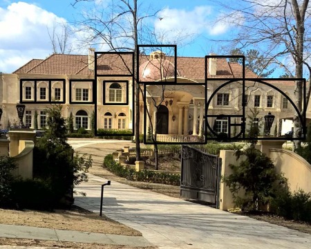
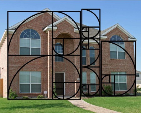
The exercise was much more difficult with this “house” and the one below. Indeed, I couldn’t make it work. No mater how many ways I scaled, rotated, moved, repeated, assembled, disassembled and reassemble the golden rectangle and its various parts, I could torture only a hint of classical proportions out of the image on the top and nothing from the one on the bottom.
Are aesthetics even necessary?
It is only fair for me to reveal that, for me, the two places above qualify for “McMansion” status, which is nicely itemized here: McMansion Hell. Does this disqualify me? Maybe not, since if my analysis is correct, carefully worked out proportions could save even a “McMansion!” If someone sends me additional examples, I am happy to try the exercise again. I’d rather, though, evoke a positive, if fleeting, response.

Maybe it is the other way around. Could classical proportions proceed from the soul?
This little building should have come first in this discussion, as it is what made me examine the composition of beauty that I found residing there. Like some parti for elegance, not only does it appear to be returning to nature, but from the standpoint of proportion, it just might be.
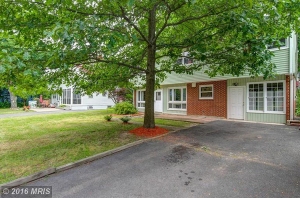
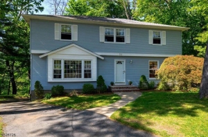
If I told you that these two houses were essentially the same house, what would you think? Would you say “no way!” They don’t look anything alike. One is quite pretty and contemporary. The other is dated and very ordinary. Anyone can see that they are very different.
Are they not stick built boxes with low pitched roofs and asymmetrical street elevations? Do they not have two stories with horizontal siding on the upper level and garrison style colonial shapes? Are they not about the same size and maybe even construction quality? Are they not basically the same?
What makes them look so different? Why does the green house appear modern and relevant and the blue one look like a 1965 colonial tract house that has seen better days. The answer is more simple than one might think, which is encouraging because it means that there is a fix. It is about the finishes. Before going there, let me say that I have no idea about the origin or remodeling history of these two houses. Whether the finishes are newly added or original matters not at all, as it is about the materials that were used and how they were applied.
If we make a single list of materials that are different on the street elevation of both of these houses we end up with some vertical siding, white shutters and paint. Really, that’s all! Can such a small kit of parts be applied with such divergent results? The answer, of course, is yes. Consider, for the sake of discussion, what would happen to the blue house if we threw out the shutters, added a contrasting color to the “pop out” dormer and and reversed the first floor siding so that it was vertical instead of horizontal. Anyone brave enough to undertake it, could end up with an amazing update.
Oversimplification? Perhaps! It does, though, drive home the main reason for this discussion, which is that vertical siding makes a house look modern. Most architects will say, when used with care, it confers a stylistically modern persona and reinforces an up to date image.
